UX/UI Design · mobile app · mental health
Increasing Long-Term Engagement in a Mental Wellness App for Avocado
Redesigning the checkout to reduce friction and build user trust for PinkPillow,
a handmade marketplace
Team
UX/UI Designer (me)
Lead UX/UI Designer
Developer
Category
Mental health
Scope
Research, UX Design, UI Design, Product Strategy, Animations, Character Creation, Handoff
Background
Avocado is a friendly health buddy that supports users through everyday challenges and encourages small, consistent actions that improve their wellbeing. Through guided rituals, reflection, and conversation, the app helps users take better care of their mental health in a simple and approachable way.


Goal
Increase Long-Term Engagement
Reduce friction
Helping users access support more easily, understand what to do next, stay active and motivated in the app through gentle, pressure-free interactions over a longer period of time.


Target Audience
Target Audience
Target
Audience
People seeking a safe and supportive space to navigate everyday emotional challenges and improve their wellbeing.
People seeking a safe and supportive space to navigate everyday emotional challenges and improve their wellbeing.
Users Testing
Users Testing
Users
Testing
Conducted 5 usability tests
Covered 4 tasks + 5 questions
Collected 25 answers + observations
Ran usability tests to understand user behavior, struggles, and expectations around browsing and purchasing handmade home decor.
Notes were synthesized in Notion, where pain points, confusions, and user needs were categorized to uncover key UX improvement areas and emotional triggers influencing buying decisions.
Conducted
5 usability tests
Covered
4 tasks + 5 questions
Collected
25 answers + observations
Conducted user interviews to explore habits, frustrations, and expectations around flower shopping apps
Responses were categorized in Miro using color-coded tags (pain points, suggestions, delights, neutrals) to identify key patterns and insights
Conducted
5 usability tests
Covered
4 tasks + 5 questions
Collected
25 answers + observations
Ran usability tests to understand user behavior, struggles, and expectations around browsing and purchasing handmade home decor.
Notes were synthesized in Notion, where pain points, confusions, and user needs were categorized to uncover key UX improvement areas and emotional triggers influencing buying decisions.
Research
Checkout Rules
Checkout
Rules
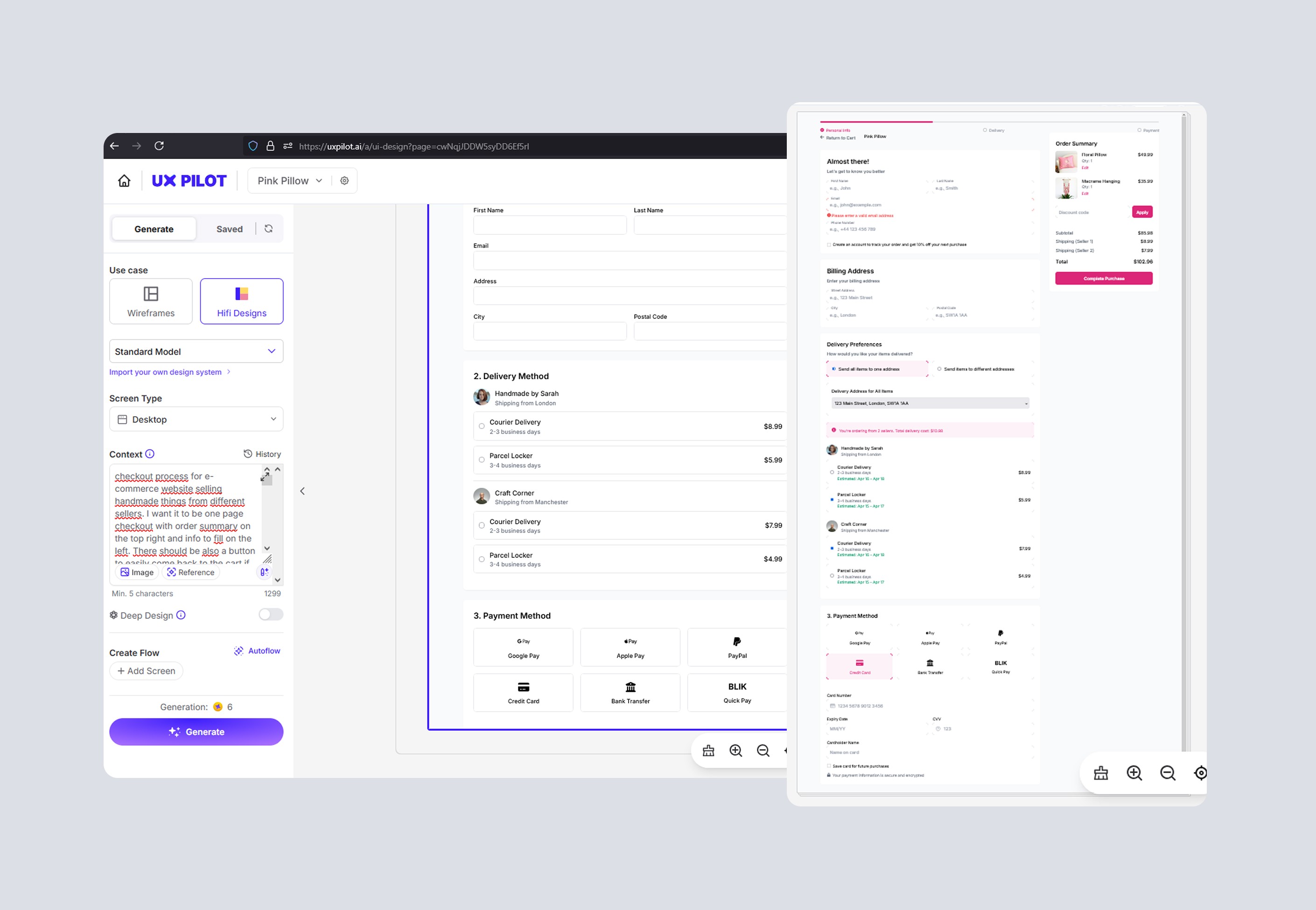
The Checkout Manifesto (16 important rules), grounded in research findings, served as a foundation for UX improvements
The Checkout Manifesto
(16 important rules), grounded in research findings, served as a foundation for UX improvements
Visual & Brand Tone
-> Direction
Users
interviews
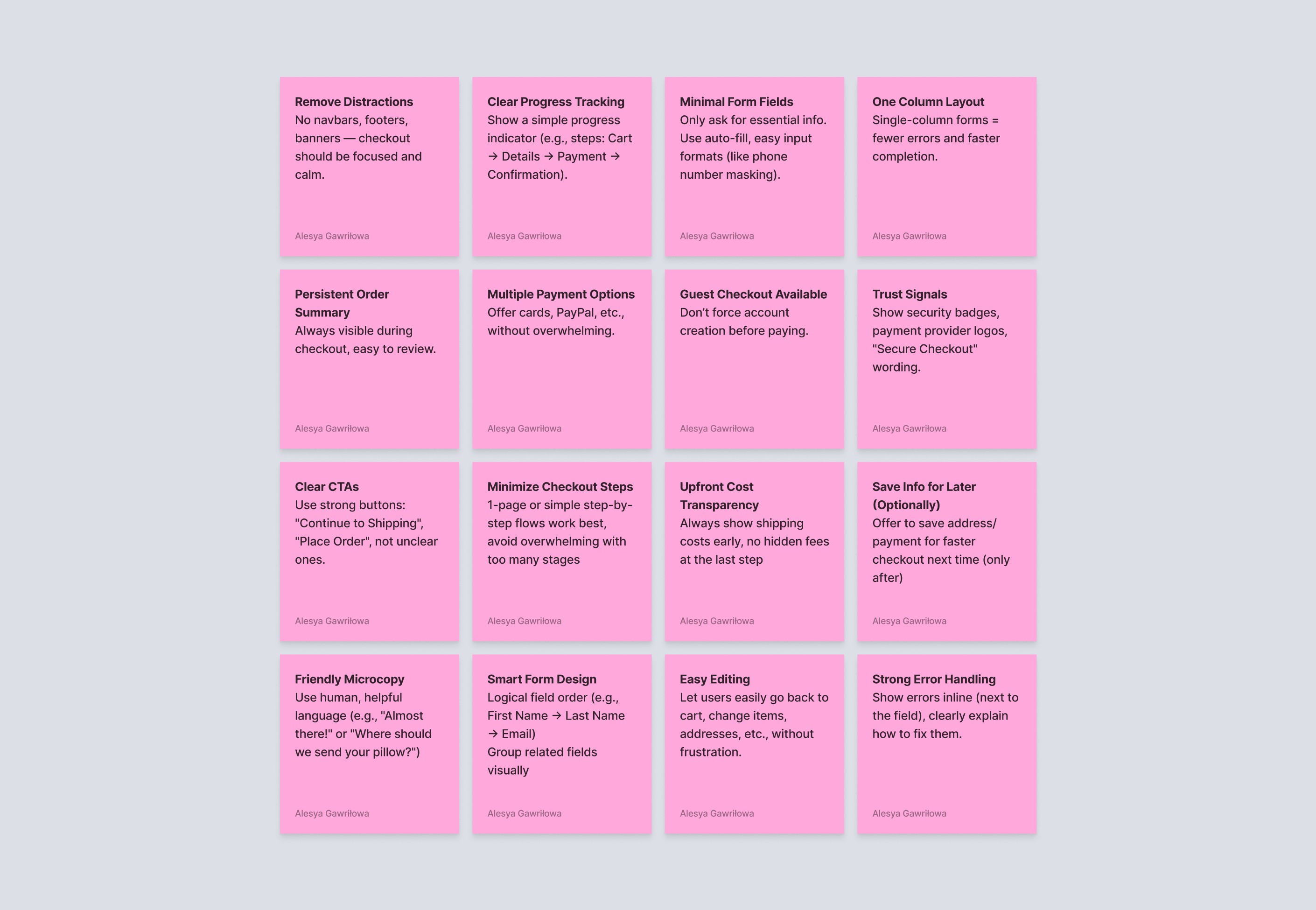
Exploring Visual Direction with Midjourney
🧶Before
I’d usually build moodboards manually by collecting reference shots and UI inspiration from Behance/Dribbble/Pinterest — time-consuming and often narrow in scope.
⚙️With AI
I used Midjourney to quickly generate multiple visual concepts for UI direction — exploring tone, brand feel, and overall atmosphere before starting detailed design.
🚀 Impact
Helped me clarify the desired mood and stylistic direction early, define a stronger visual narrative, and guide UI decisions in line with brand personality.
Mid-Fi Wireframes
Mid-Fi Wireframes
Users
interviews
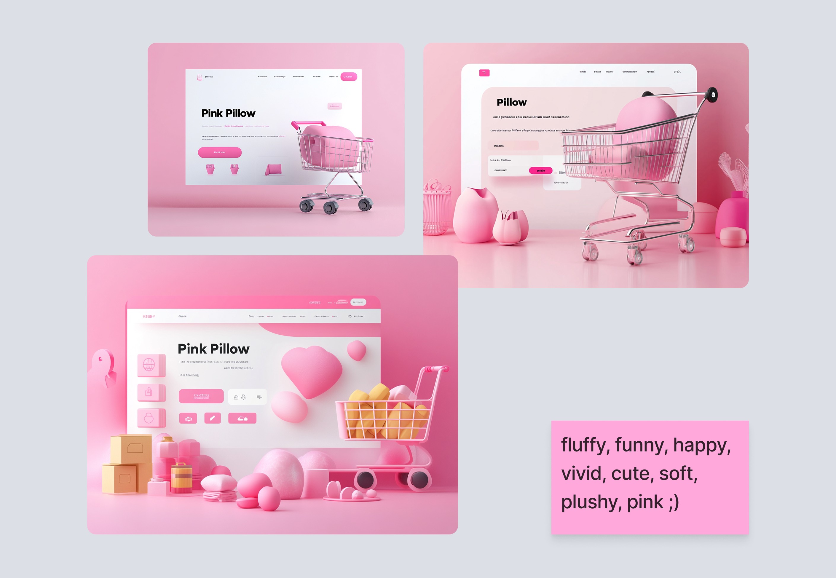
Testing UX Architecture with UX Pilot
🧶Before
I would manually iterate on UX concepts in Figma using Lo-Fi wireframes, which limited the number of variations and depth I could test in early stages.
⚙️With AI
I used UX Pilot to rapidly generate and test multiple Mid-Fi UX structures and flows (including detail-rich variants) directly from early drafts.
🚀 Impact
Reduced iteration time by ~60%, explored more layout options than I could feasibly build manually, and validated UX decisions at a deeper level much earlier in the process.
Reduced iteration time by ~60%
Testing UX Architecture with UX Pilot
🧶Before
I would manually iterate on UX concepts in Figma using Lo-Fi wireframes, which limited the number of variations and depth I could test in early stages.
⚙️With AI
I used UX Pilot to rapidly generate and test multiple Mid-Fi UX structures and flows (including detail-rich variants) directly from early drafts.
🚀 Impact
Reduced iteration time by ~60%, explored more layout options than I could feasibly build manually, and validated UX decisions at a deeper level much earlier in the process.
Reduced iteration time by ~60%
Exploring Visual Direction with Midjourney
🧶Before
I’d usually build moodboards manually by collecting reference shots and UI inspiration from Behance/Dribbble/Pinterest — time-consuming and often narrow in scope.
⚙️With AI
I used Midjourney to quickly generate multiple visual concepts for UI direction — exploring tone, brand feel, and overall atmosphere before starting detailed design.
🚀 Impact
Helped me clarify the desired mood and stylistic direction early, define a stronger visual narrative, and guide UI decisions in line with brand personality.
Top pain points
Top pain
points
01
Cart & Delivery Confusion
02
Weak Progress & Feedback Cues
03
Low & Inconsistent Visual Hierarchy
Mid-Fi Wireframes
Testing UX Architecture with UX Pilot
🧶Before
I would manually iterate on UX concepts in Figma using Lo-Fi wireframes, which limited the number of variations and depth I could test in early stages.
⚙️With AI
I used UX Pilot to rapidly generate and test multiple Mid-Fi UX structures and flows (including detail-rich variants) directly from early drafts.
🚀 Impact
Reduced iteration time by ~60%, explored more layout options than I could feasibly build manually, and validated UX decisions at a deeper level much earlier in the process.
Reduced iteration time by ~60%
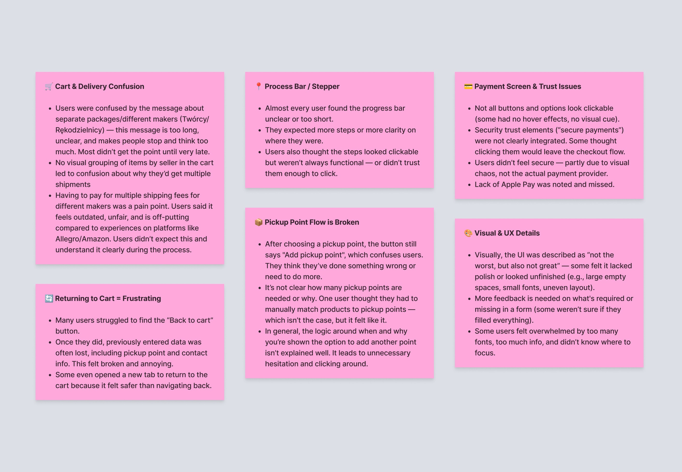
Top pain points
01
Cart & Delivery Confusion
02
Weak Progress & Feedback Cues
03
Low & Inconsistent Visual Hierarchy
Solutions
The 3 primary areas of focus for solutions
The 3 primary areas of focus for solutions
Friction Reduction
Clarity & Confidence
Trust & Transparency
Friction Reduction
Clarity & Confidence
Trust & Transparency
Redesign
01
01
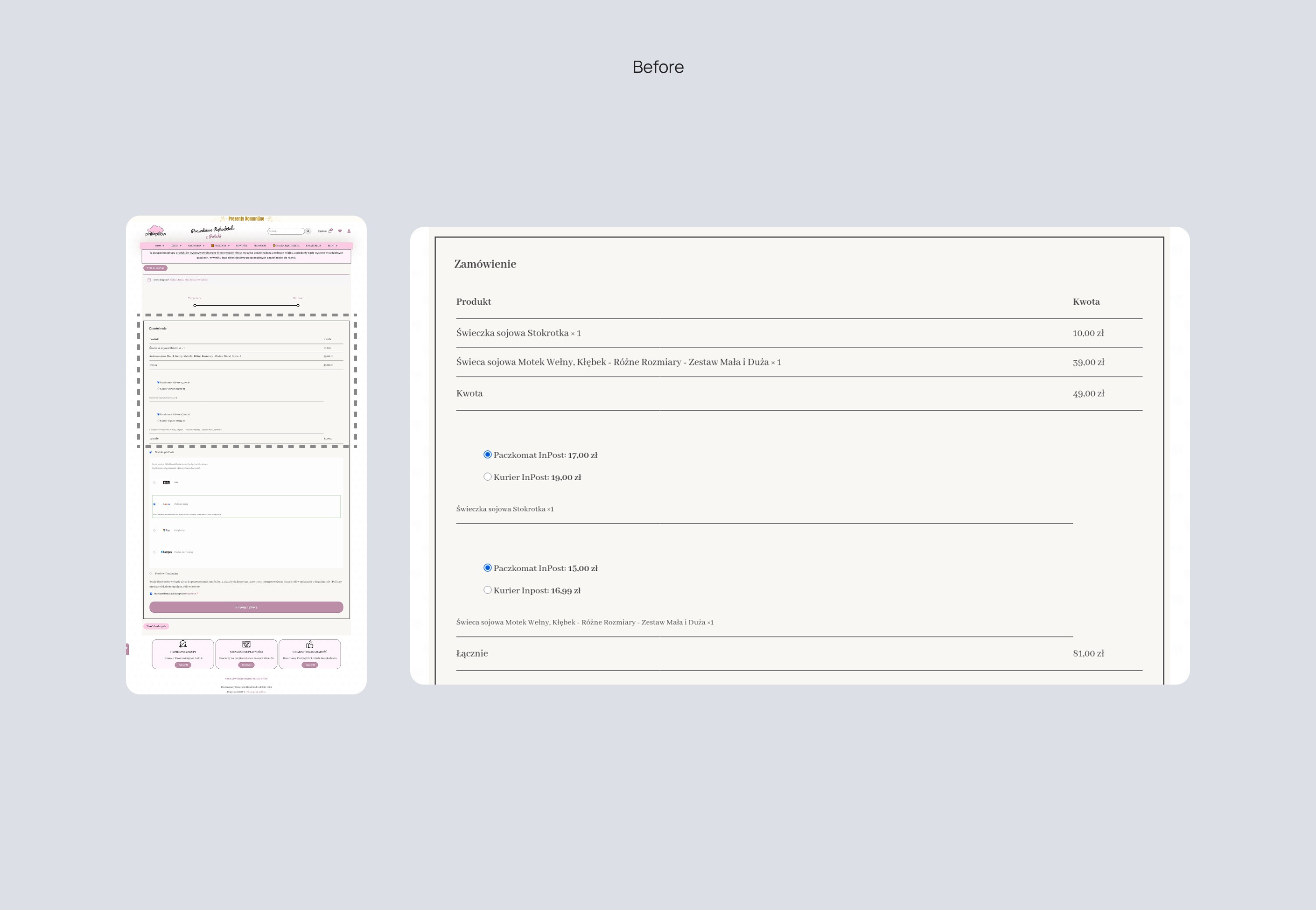
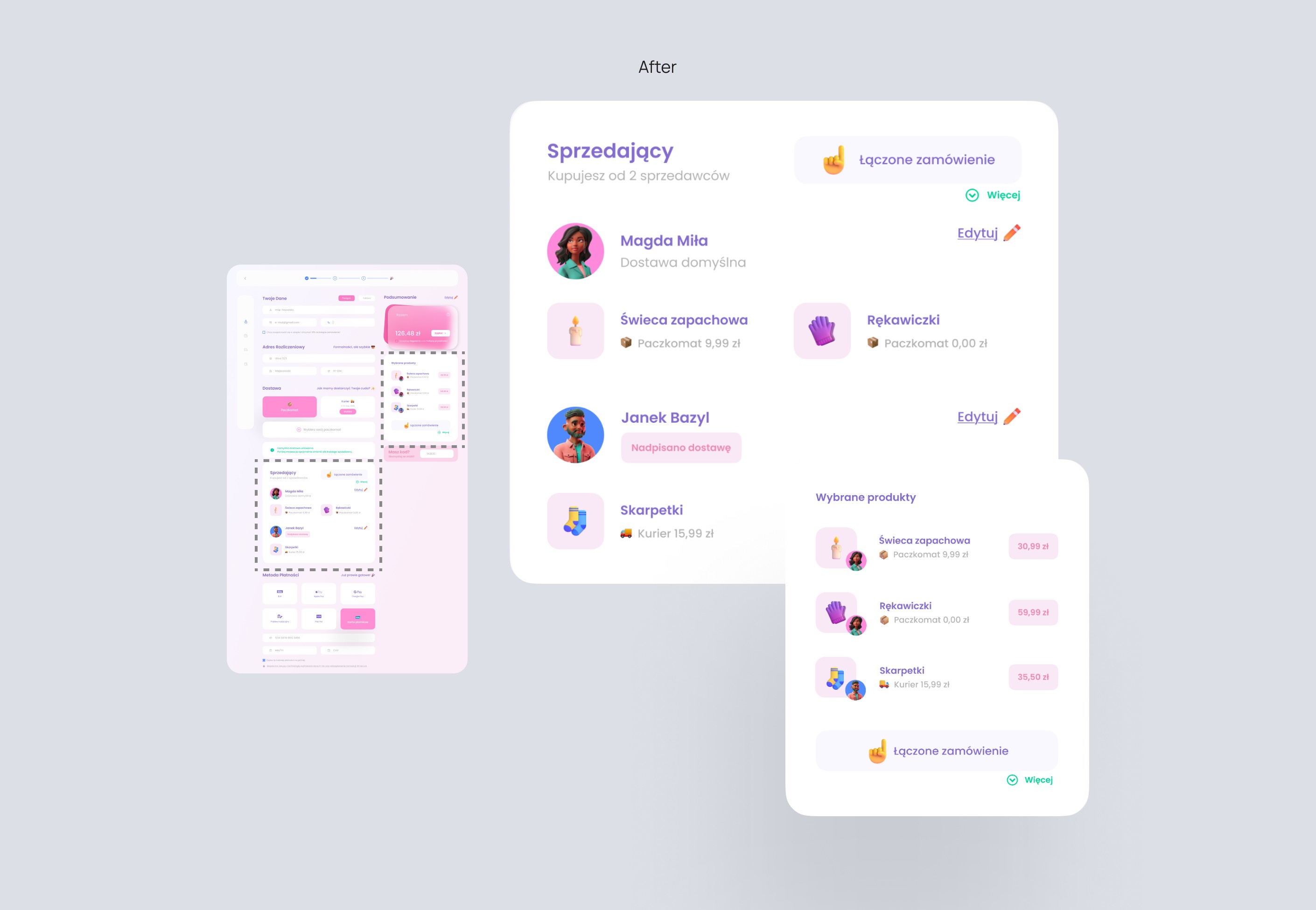
Order Summary & Buying from Different Sellers
Order Summary & Buying from Different Sellers
Before: Optimized navigation flow by adding clear sections, actionable icons, and accessibility features to enhance the overall browsing experience
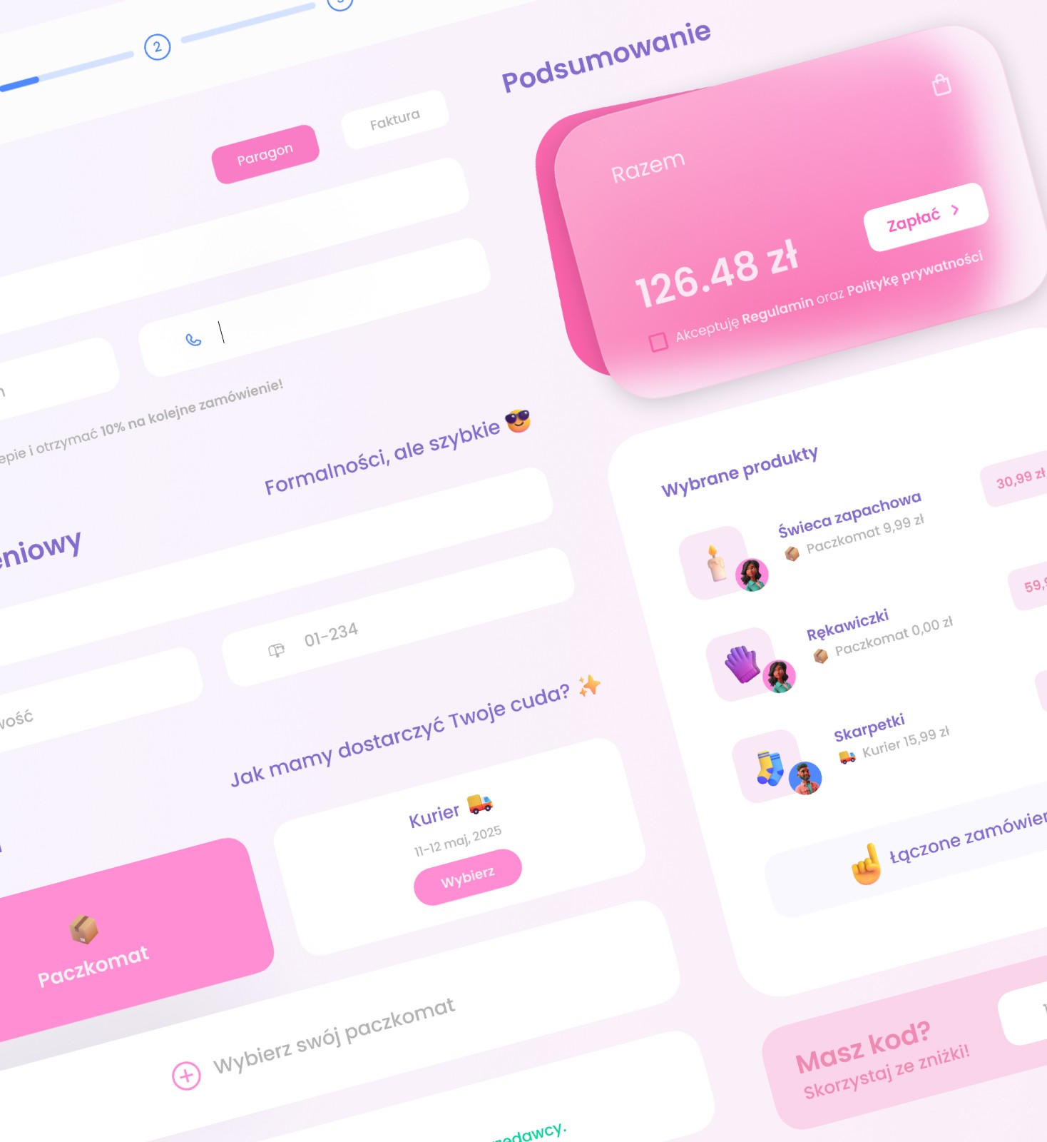
After: Added a “Combined order” label and clear seller breakdown, with bold, eye-catching info. Delivery is linked to each product, making it all easier to understand.
Before: Optimized navigation flow by adding clear sections, actionable icons, and accessibility features to enhance the overall browsing experience
After: Added a “Combined order” label and clear seller breakdown, with bold, eye-catching info. Delivery is linked to each product, making it all easier to understand.
Redesign
02
02
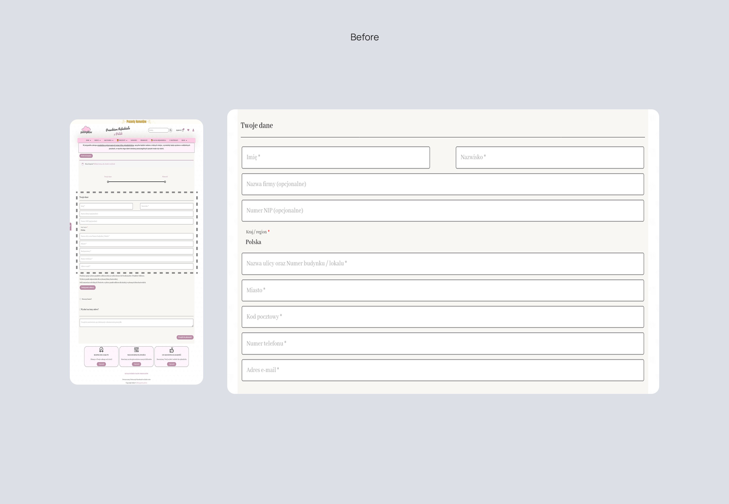
Forms
Forms
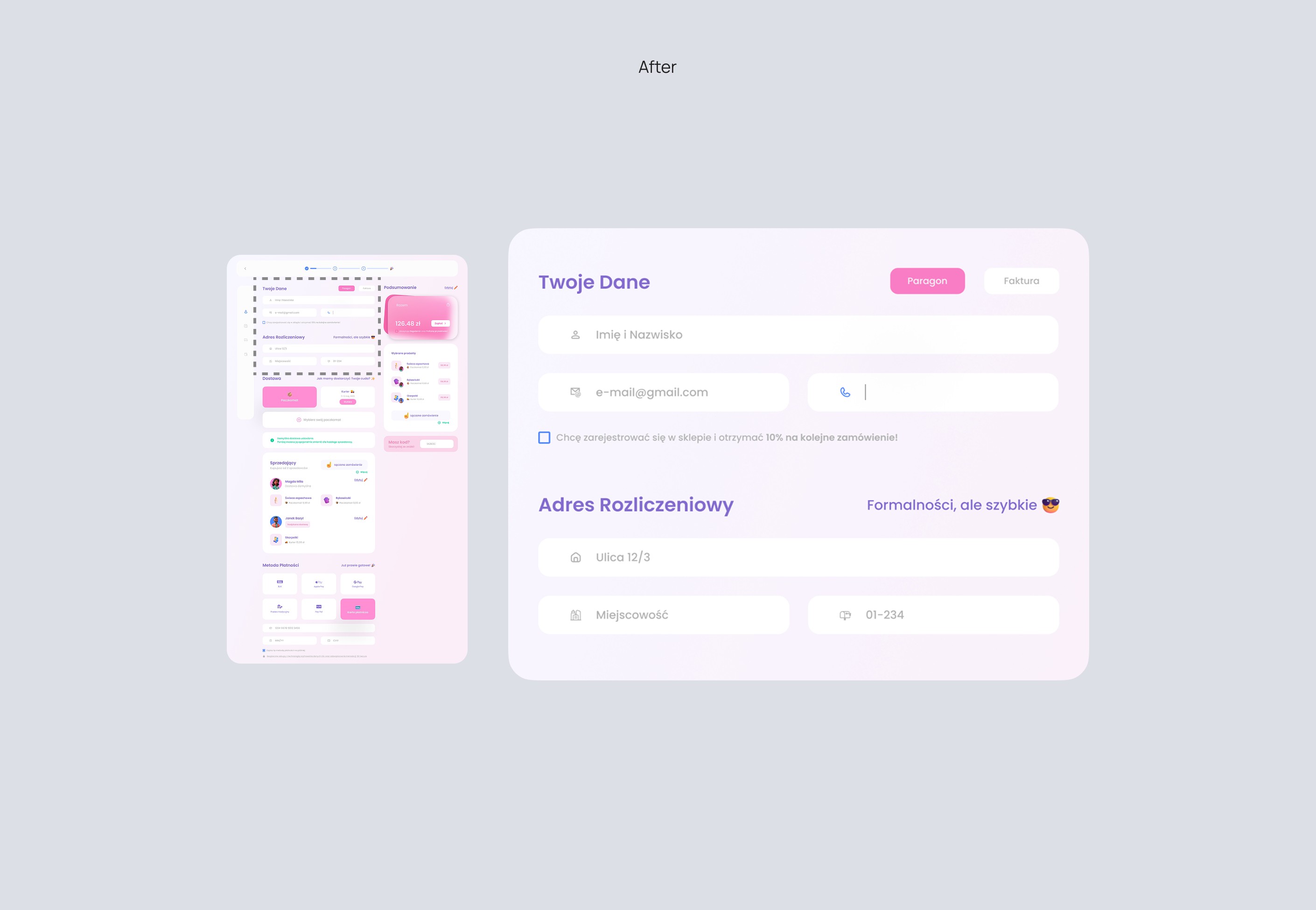
Before: The summary didn’t show who the sellers were or how deliveries matched with each product. Info was scattered and hard to follow.
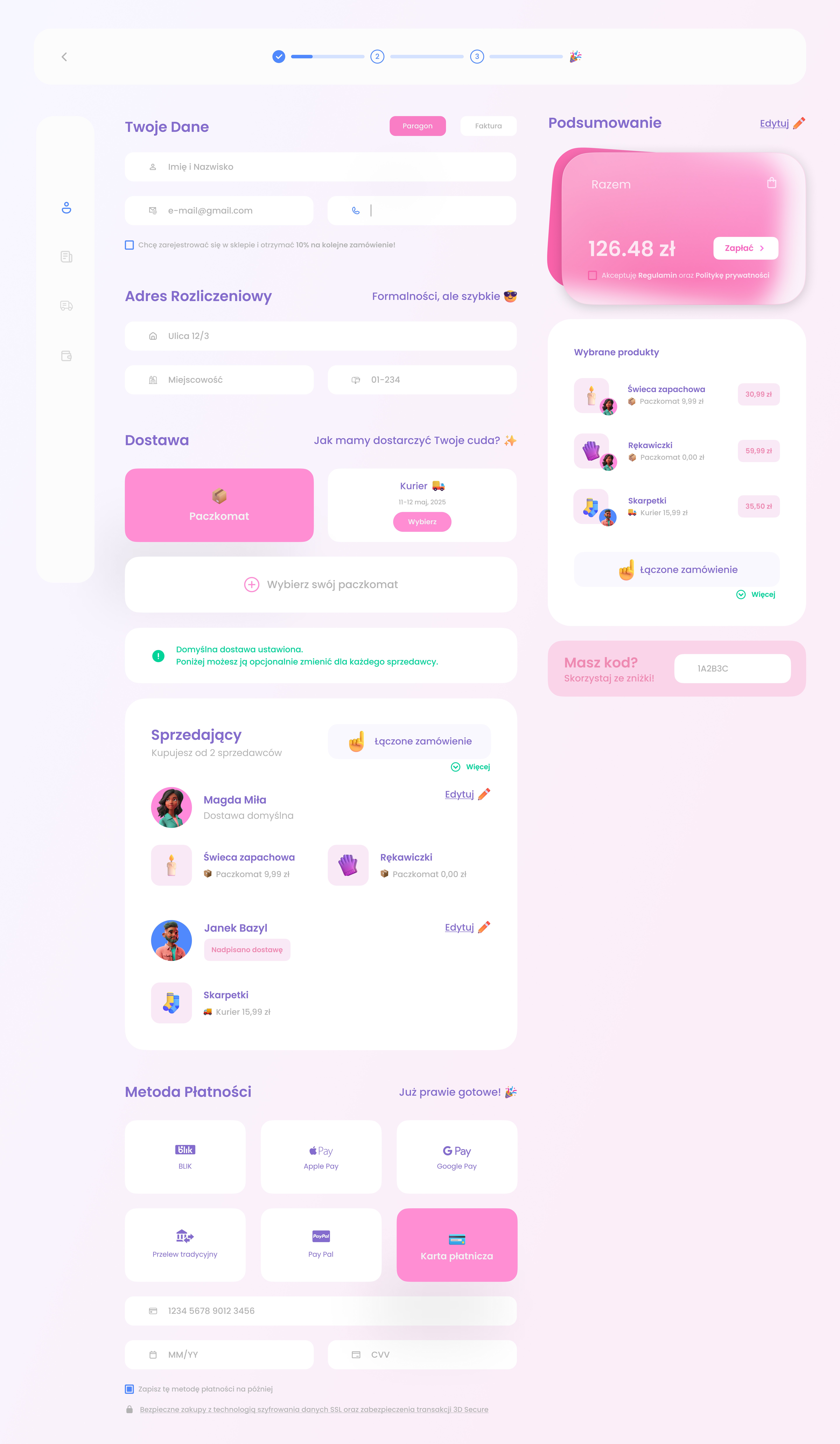
After: Split into smaller sections with grouped fields, added icons and spacing to make it clean and user-friendly.
Before: The summary didn’t show who the sellers were or how deliveries matched with each product. Info was scattered and hard to follow.
After: Split into smaller sections with grouped fields, added icons and spacing to make it clean and user-friendly.
Redesign
03
03
Progress Bar
Progress Bar
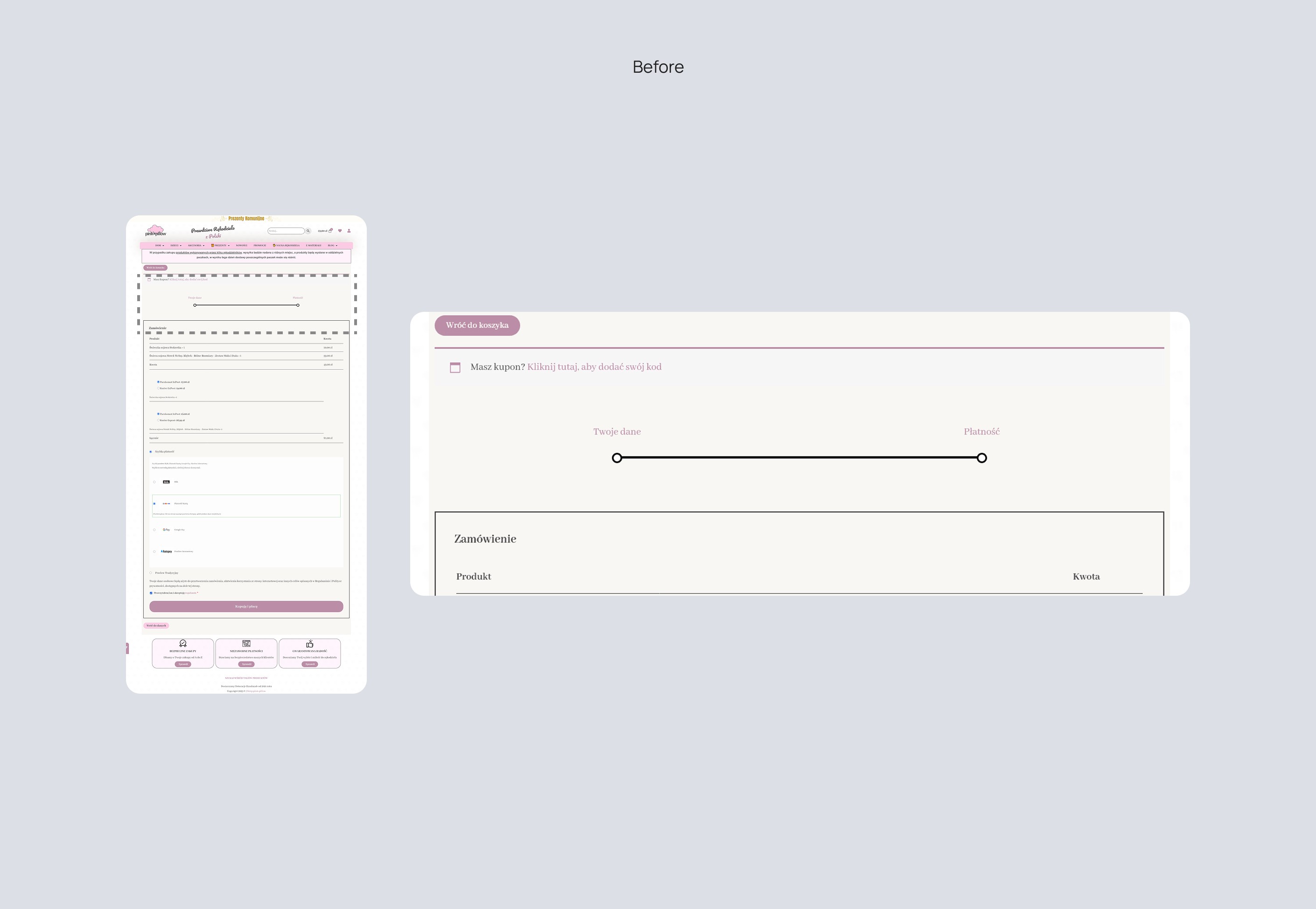
Before: The step tracker looked like a slider and didn’t clearly show where you were or how many steps were left.
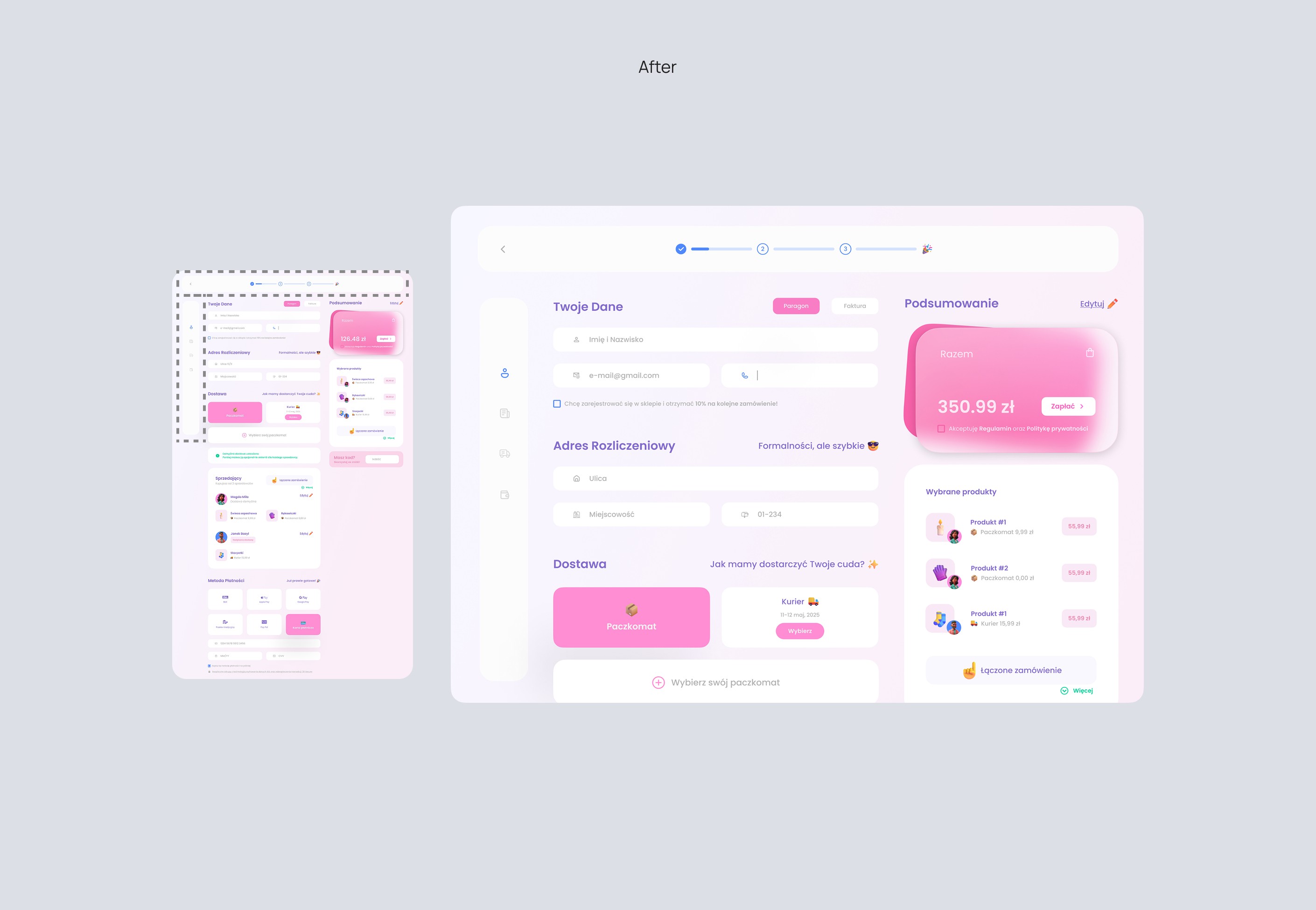
After: Added a real progress bar at the top and a side menu for navigation—easy to track progress and move between steps
Before: The step tracker looked like a slider and didn’t clearly show where you were or how many steps were left.
After: Added a real progress bar at the top and a side menu for navigation—easy to track progress and move between steps
Redesign
04
04
Delivery
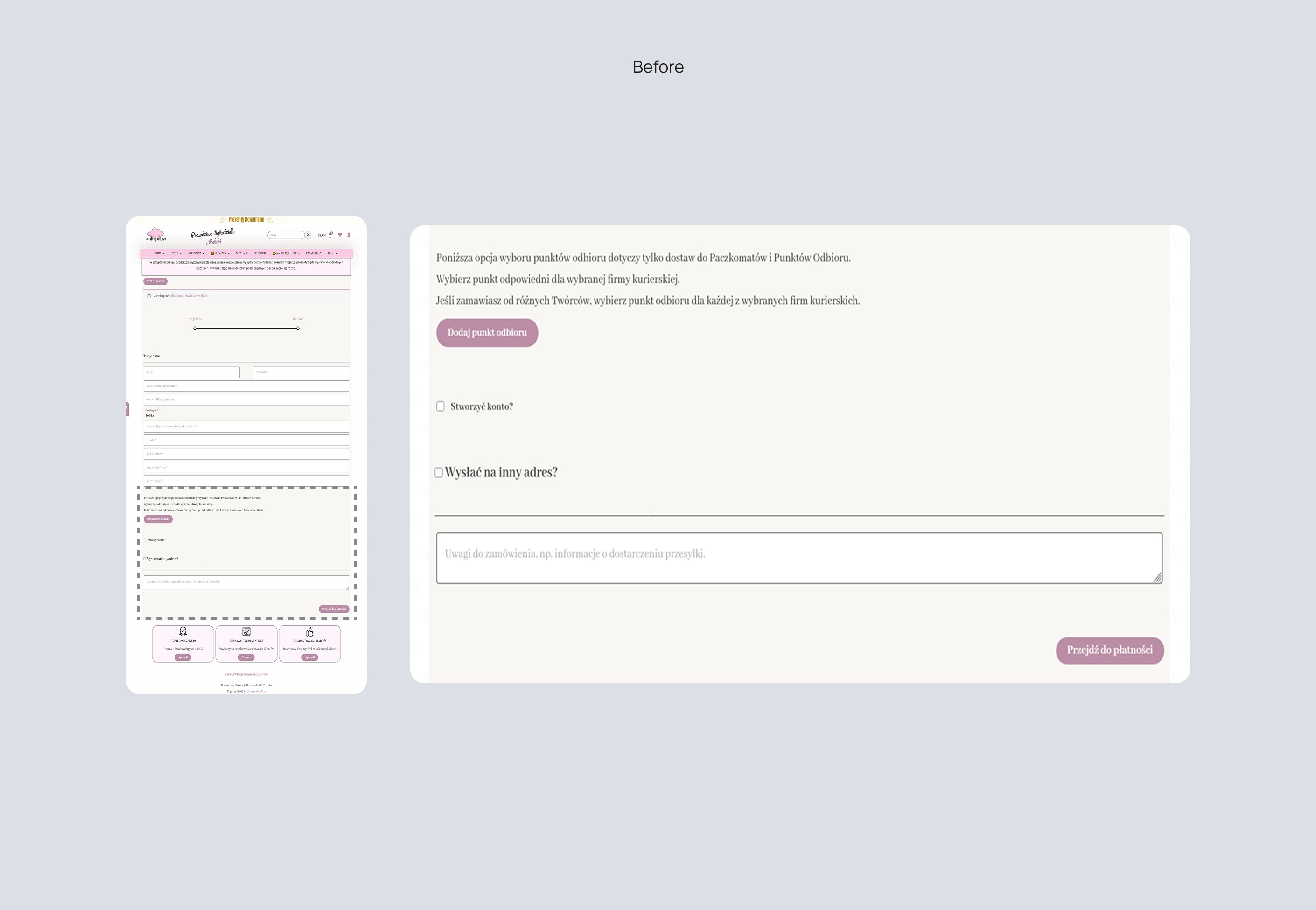
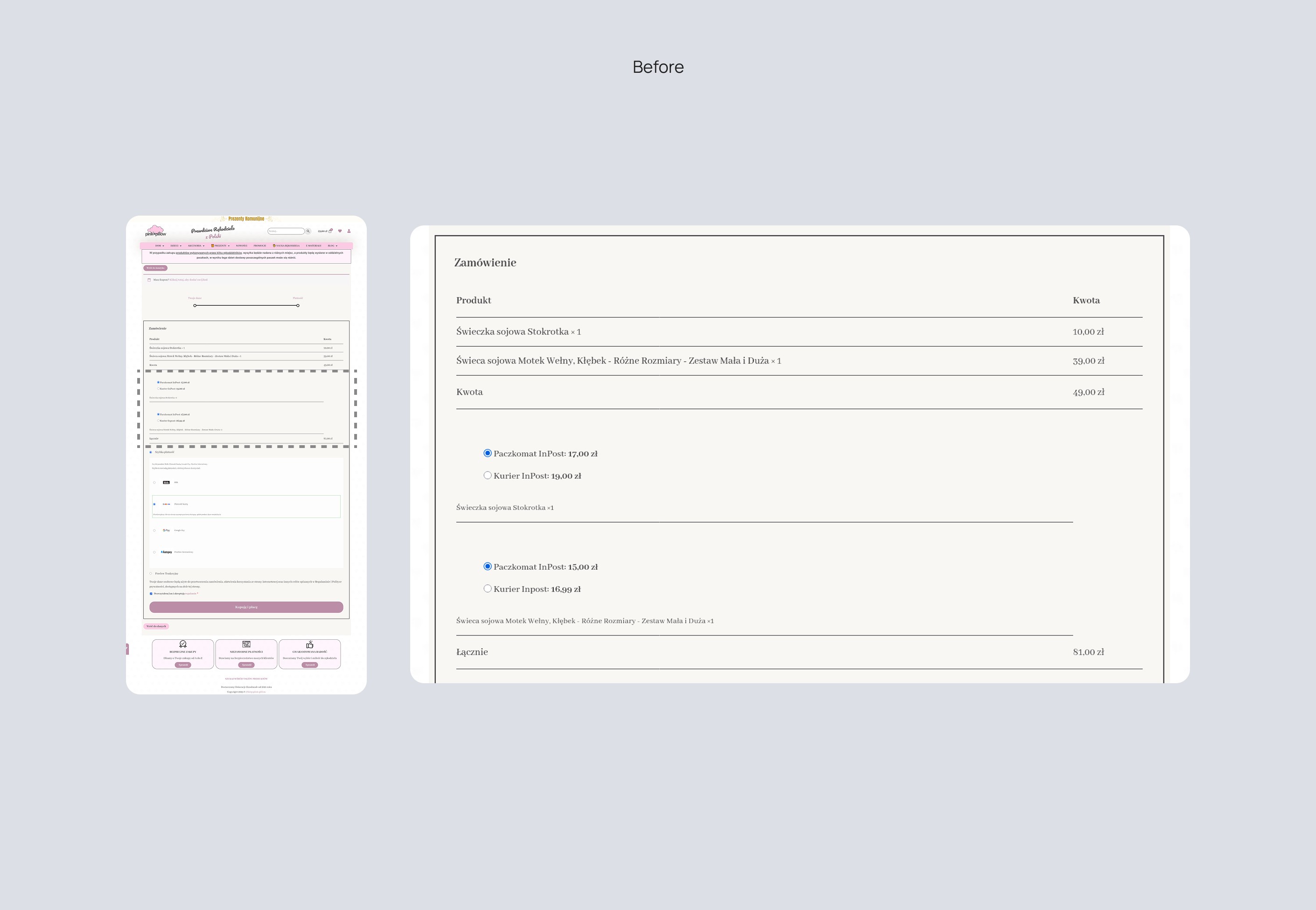
Before: Delivery options were split across two screens and repeated, leading to confusion about what was selected or still needed.
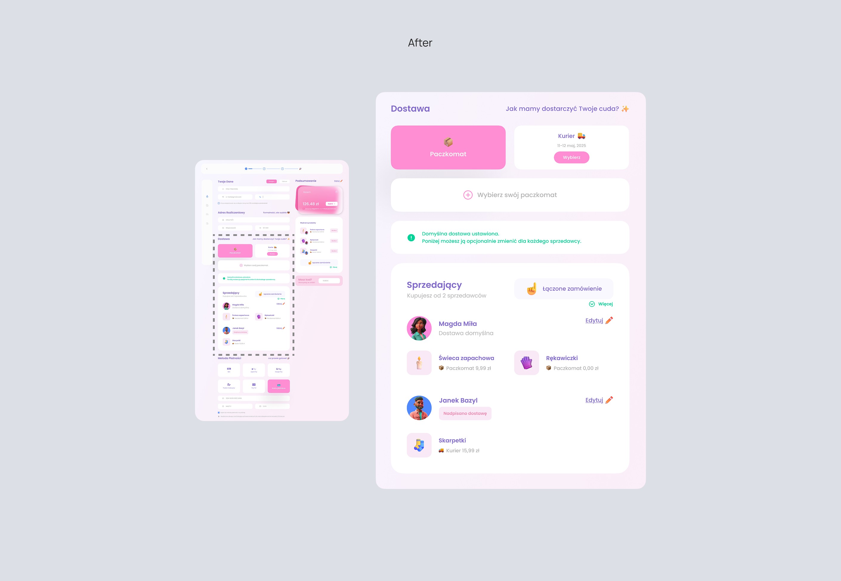
After: Made it one clear section with focused delivery options, a helpful color-highlighted note, and a smooth transition to managing per-seller deliveries.
Before: Delivery options were split across two screens and repeated, leading to confusion about what was selected or still needed.
After: Made it one clear section with focused delivery options, a helpful color-highlighted note, and a smooth transition to managing per-seller deliveries.
Redesign
05
05
Payment Methods
Payment Methods
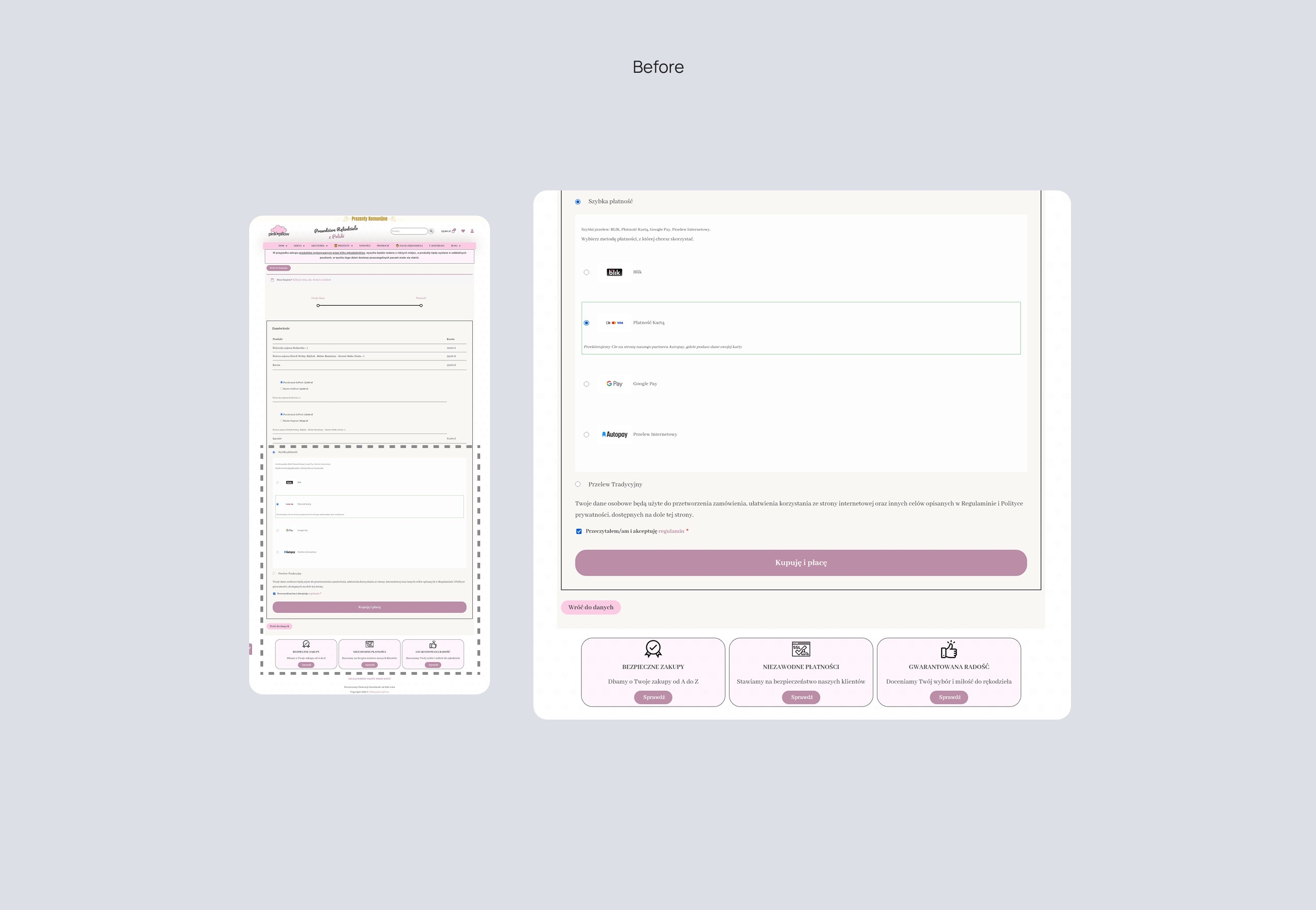
Before: Layout was too spaced out and some payment types looked like they didn’t belong. Font size was also too small in places.
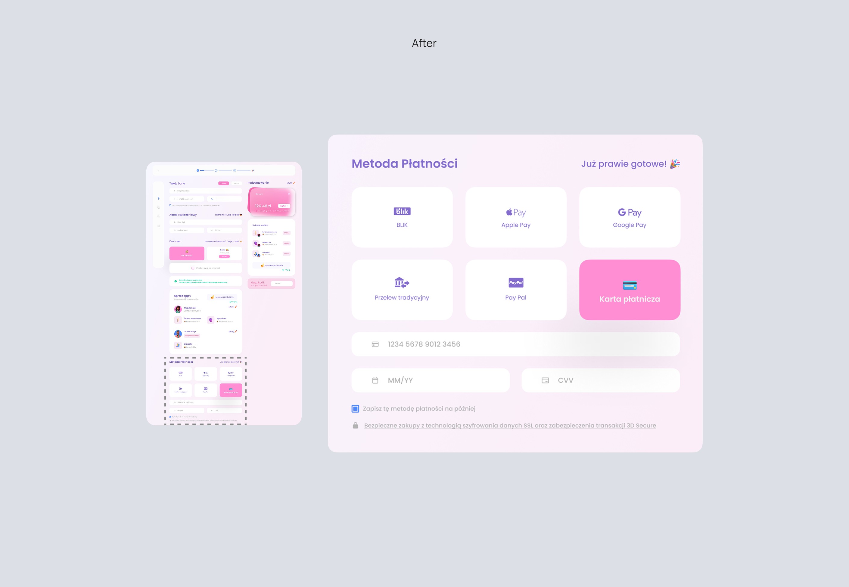
After: Grouped all options in one tidy, compact view with consistent style and larger fonts for readability.
Before: Layout was too spaced out and some payment types looked like they didn’t belong. Font size was also too small in places.
After: Grouped all options in one tidy, compact view with consistent style and larger fonts for readability.